
Figma is a collaborative design tool for Web, macOS, and Windows. Figma is very popular in the design industry, so Adobe has agreed to acquire Figma for approximately $20 billion. Figma can be used as a design tool and prototyping tool.

As for Webflow is a visual web development used by companies like Zendesk, Rakuten, Dell, Discord, and Github. Webflow makes it easier to develop professional websites without code and relatively faster than traditional coding.

Figma is our design tool choice. It’s accessible widely via the Web, Fast, and works just like any other design tools we used before. Figma and webflow are a great duo!
Note that this Figma to webflow guide applies to Figma alternatives like Sketch, Adobe XD, and other design tools.
Creating a Style Guide Page
Creating a style guide page streamlines transforming Figma to Webflow and helps your design process.
Also, because we are creating a website for different screen sizes when you design in Figma, we recommend at least designing for two screen sizes, Desktop and Mobile.

If you hand off the design from designers without the style guide, it’s okay :). Some designers have their way of designing websites, and next time, you can communicate with the designer first. Also, You can build the style guide in Webflow directly.
Here are what should exist on your style guide page and things you should pay attention to and remember, always design the style guide on two versions, desktop, and mobile. This will save you some time when building in Webflow.
Container
Containers are used to pad the content inside of them and will make the content tidier.
How many? It depends on what you want to design. But make sure to add it to the style guide.

Typography
Create Heading 1 to Heading 5 and some text size.
Utilize Figma components to make it consistent across pages and easier to identify later.

Colors
Remember to add colors to the Color Styles and only use what’s in this.

Spacing
There’s two spacing, section, and elements.
- Section spacing. The section is a horizontal row that groups content. It’s usually Small, Medium, and Large.
- Elements spacing. Space between elements, make sure it is consistent across breakpoints.

Button
Create the primary and secondary buttons and also the hover effects state.

Exporting Assets
If the design is final, the next thing is to export the assets, like images and icons.
There are two strategies for this: you export all the assets at once or export them per page. The latter is faster because when in Webflow, it’s easier to find what assets to use on the page you are working on.
How to Export Images and Icons
We recommend exporting them by 2x of the size for a more crispy look. Don’t worry. Webflow hosting is powerful enough, so this won’t make your sites slow. Just make sure not to use them as background images :).

After that, you can compress using tools like Tinypng.
For illustrations and icons, export them as SVG at 1x size.
How to Export Typeface and Font
If you didn’t get the typeface from the designer, You can analyze the design using a Plugin called FontScanner and download them. Hopefully, it’s google font. Remember, only download the font used in the design, such as 400, 700, or 800.

Next is to convert them to .woff2 by a tool called CloudConvert. This will make your site faster, but remember to check on the older browser, as some typefaces have errors.
Start Building in Webflow

Here’s the main thing, and we’ll make it a simple steps:
- Upload the typeface on the project settings.
- Go to the Designer interface.
- Create a Style Guide and set the page to Draft so it won’t be accessible to the public.
- Create the page structure. Add a Custom Code as a Component on every page. Trust me. It will be helpful someday.
- Get started by creating classes we prepared on the Style Guide page in Figma, Typography, Colors, Container, Spacing, and Buttons. If the style guide is on Desktop and Mobile, you can immediately apply it in Webflow for both breakpoints.
- Complete the build based on the design. Webflow makes it easy to create styles, so don’t rely on Global Classes for everything. Just use the classes on the style page for global and do custom classes for the rest.
Testing the Website
You can test the website in the browser Inspect tool (chrome) or Responsive Design Mode tool (Safari). For mobile, we also recommend trying it on the actual device.
Pro Tip: Use the extension Pixelparallel to match your design and the website pixel by pixel. This also makes it easier to catch some typos.
How to Test a website in Inspect Tool
Right-click on the website and click the Inspect

Select the Dimension: Responsive. You can easily play change to the breakpoints and see how the website adapts to the screen size.

Pro Tip: You can add a custom breakpoint to the settings.
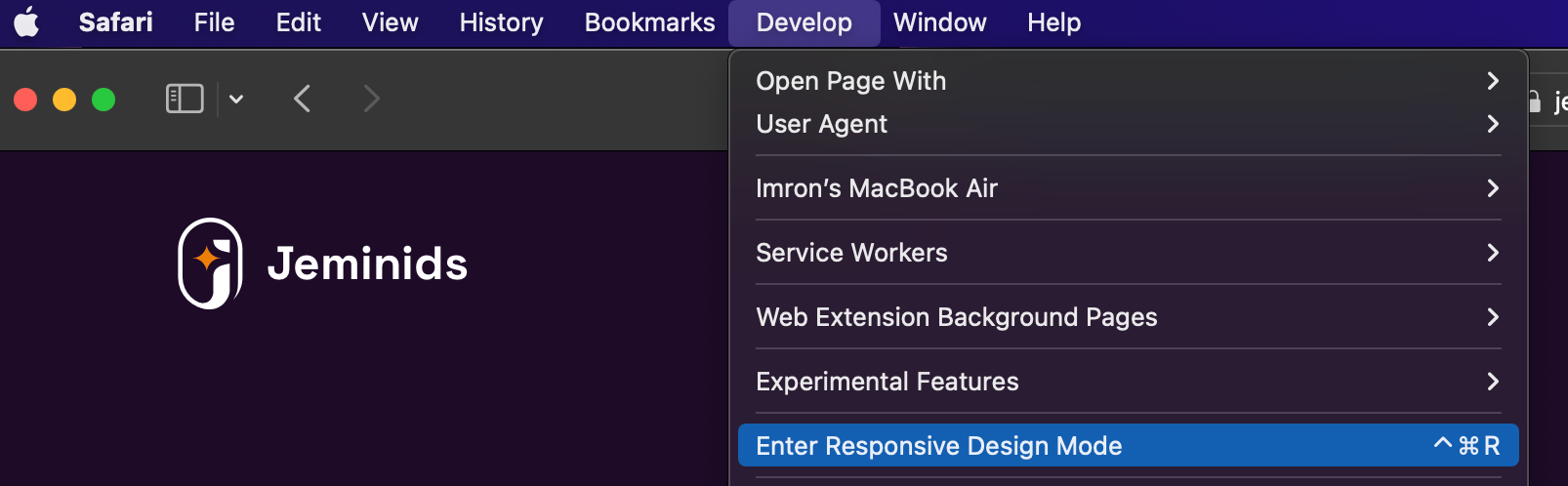
How to Test a website in the Responsive Design Mode Tool
This’s a developer feature. To activate, go to Safari > Preferences, click Advanced, then select “Show Develop menu in menu bar” at the bottom of the window.

Next, to open up the Responsive Design Mode Tool, go to the Safari Menu Developer > Responsive Design Mode.
Like the Inspect tool, you can view the website on different breakpoints.

That’s it how to turn your Figma to Webflow!
Sometimes building a website using Webflow is only for some, but it’s great if you have time and enjoy learning new stuff. But, if you want some free time, let us help you with our services. Learn more about how to hire us here.
Pro Tip: You’ll speed up so much time by using the Client-First system by Finsweet as we do.